NYC Taxi Data Python + SQL Analysis
Using SQL and Python to analyze an NYC taxi dataset.


Background
The goal of this project was to present an end-to-end analysis of a dataset of our choice using a Google Collab notebook. It was recommended to associate data from multiple sources to perform analysis.
We started this project by finding a dataset that was interesting to us. In doing this, we were looking for a large dataset (at least 100k examples), with interesting features for us to look at. We settled on a dataset from Kaggle showing data from NYC yellow cabs from the year 2015.
At this point, we tried to think of other types of data that we could associate with this dataset in order to draw meaningful conclusions. We decided that looking at census information from a geographical perspective would help us link socio-economic characteristics to the taxi cab data, so we tapped into NYC Census data from that same year. This dataset was useful to us as it included latitude and longitude definition of each census block. We also tapped into a Census Tract dataset from 2015 which supplied us with demographic information, income levels etc and could be linked to census blocks.
Finally, we wanted to see whether weather had any impact on the number of rides or other metrics, so we included a dataset of historical weather data in NYC.
Data Access, Storing and Cleaning
We started the project by utilizing Python to create tables in mySQL from each dataset. With some large datasets composed of tens of millions of examples, our group had some challenges. We were eventually able to create those data tables (using a mix of patience and random row selection to reduce table size) and moved on to data cleaning.
The data contained some outliers that we decided to remove from any "average" calculations. For example, some rides showed distances of 0 miles and some showed distances above 1 million miles!
Linking the census block table (containing geographical coordinates) and census tract demographic data presented challenges as well. Datatypes didn't allow us to truncate numbers the way we wanted to in order to link blocks to tracts, so we had to play around with changing types and truncating scientific notation in order to be able to utilize these numbers.
Once we had removed outliers and ensured that data types allowed us to create links between tables, we began our analysis.
Analysis
Overview
We first wanted to get an idea of what taxi cab rides in NYC looked like geographically. Using an import of an NYC map and the latitude and longitude points for the start and end of each ride, we were able to map out the Pickup and Dropoffs in NYC for that year.
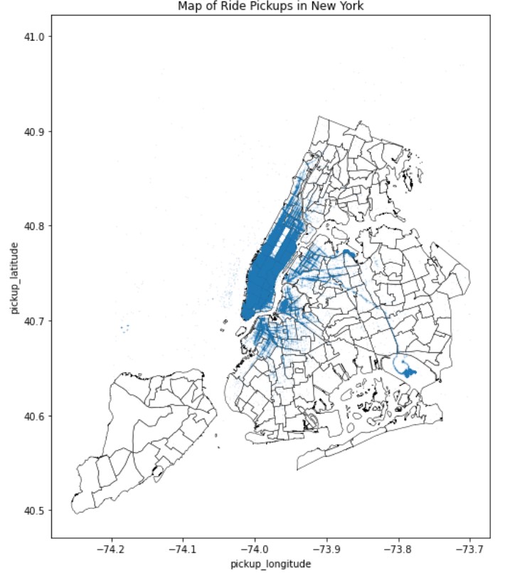
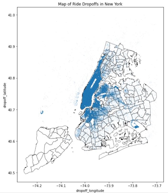
We were able to conclude that (unsurprisingly), Manhattan is the highest activity borough. Interestingly, we can also see that pickups outside of Manhattan more sparse than drop-offs, and we see a visible hotspot for dropoffs at JFK airport.
Wanting to take a closer look at Manhattan, we generated a heat map for pickups.
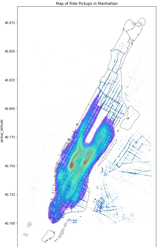
We can see that south midtown is the highest pickup activity point.
Digging Deeper
To get a better understanding of ride cycles and frequency, we created graphs to look at trip distance per day of the week, number of daily ride pickups, cab volume per hour of the day.
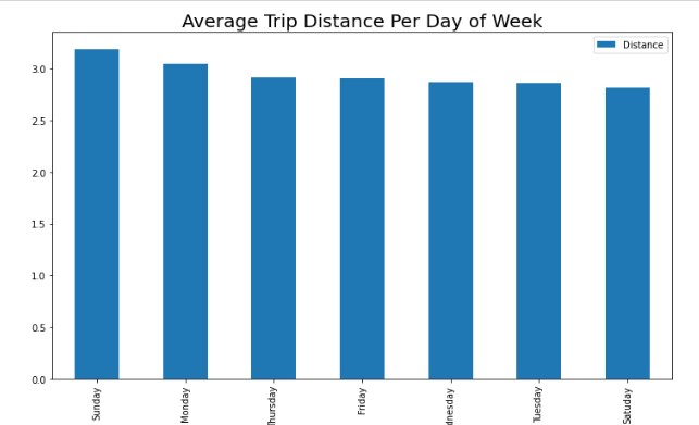
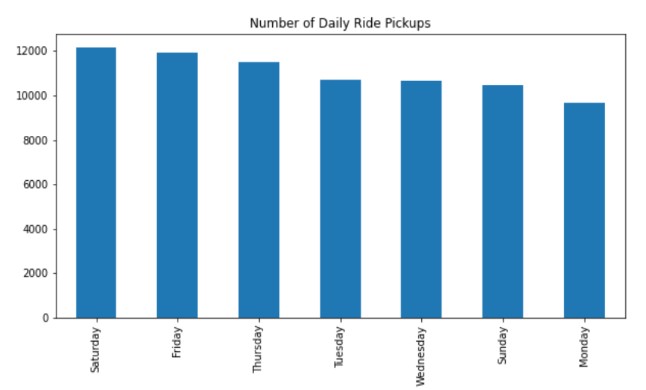
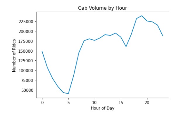
We can see that trip distance is highest on Sunday and Monday, however the highest amount of pickups is shown as Saturday and Friday. Number of rides rises in the morning starting at 5AM and sees a sharp dip between 3 and 4PM, before coming up again in the evening.
In an effort to capture commuting crowds, we performed Manhattan mapping of pickups and dropoffs in the mornings and afternoons. We did the same for broader NYC area to capture rides to and from airports.
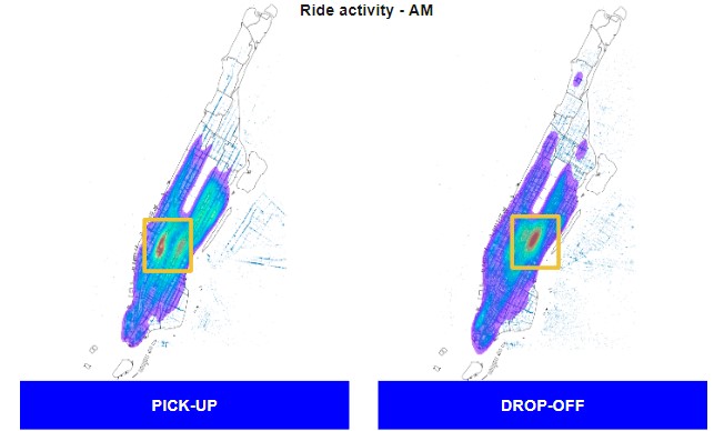
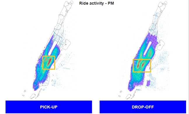
A significant concentration of weekday morning taxi drop-offs are at or around Grand Central station. A significant concentration of weekday evening taxi pickups are at or around Grand Central station. We can imagine that this is due to commuters reaching the train station in the morning and returning in the evening.
Understanding Ride Characteristics
Using total cost and tipping information as well as ride codes defining ride type, we were able to chart ride costs per day of the week, travel to JFK airport and tipping habits.
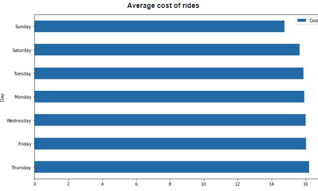
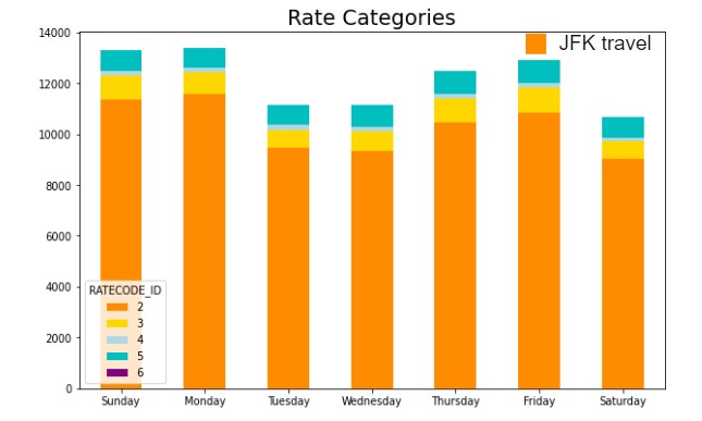
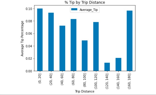
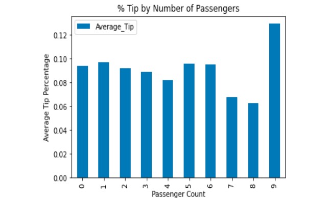
Surprisingly, even though we've seen that the average trip distance is highest on Sundays, we can see that cost is lowest on Sundays and much higher on Thursdays. Using ratecodes indicating trip type, we can see that travel to JFK and from JFK is highest on Friday and Sundays, accommodating for weekend travel. The average tip percentage mostly trends down as distance increases, but comes back up for longest distances. Percentage tip by number of passengers stays relatively stable until it reaches 9 passengers. It is hard to imagine 9 people fitting into a New York taxi cab, so we could potentially imagine that these are errors in the data.
Using census income data and location of ride pickups, we were also able to connect income to tip percentage:
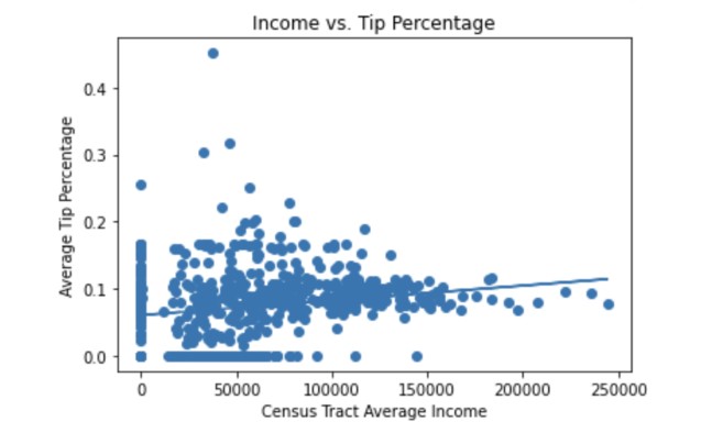
Tip percentage and income had a correlation coefficient of 0.178 and p value of 1.05e-05, showing a statistically significant relationship.
Looking at Weather Impact
To understand whether temperature, rain or snow had an impact on ride activity, we charted number of rides as a function of inches of rain or snow as well as temperature.
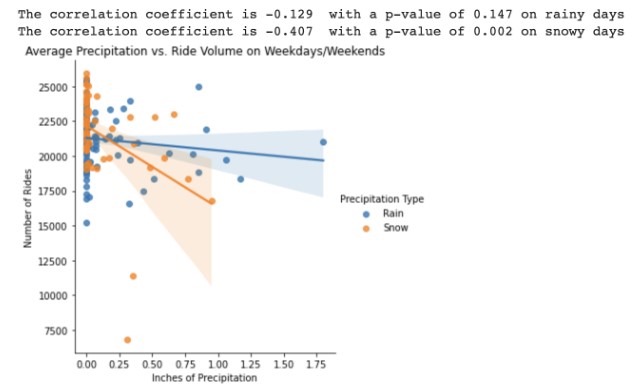
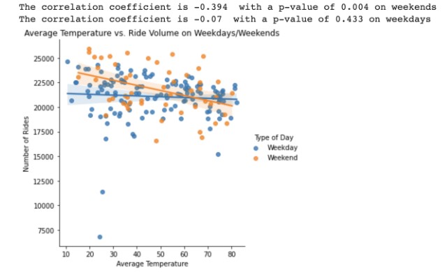
While we found no statistically significant correlation between rain and the number of cabs called on a given day, there is a statistically significant correlation with snow: more snowfall means less cab rides. We also found that temperature does not influence the number of cabs people call on a given weekday, but on a weekend New Yorkers are less likely to call a cab if it is warm.